Job Openings in the Pandemic
Project created during fall semester 2021 for the class GIS Programming with Python, during my first semester in my program as I was getting used to programming. Using data from the U.S. Bureau of Labor Statistics, I wanted to visualize and compare job data from September 2020 and September 2021 to generate insights on impacts of the pandemic on the workforce.
Data Compared: Job Openings, Job Hires, Job Quits, and Job Layoffs
Python Packages used: NumPy, Pandas, Matplotlib, Folium, BeautifulSoup4, Requests
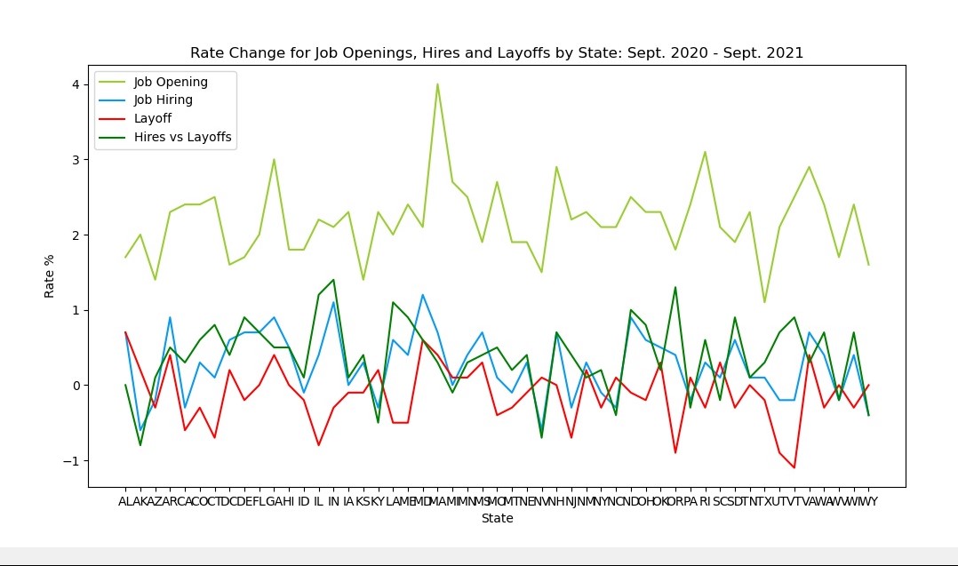
Rates of Change by State
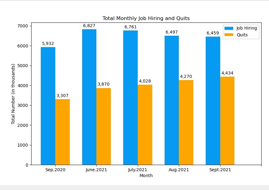
Total U.S. Job Hires and Quits by Month
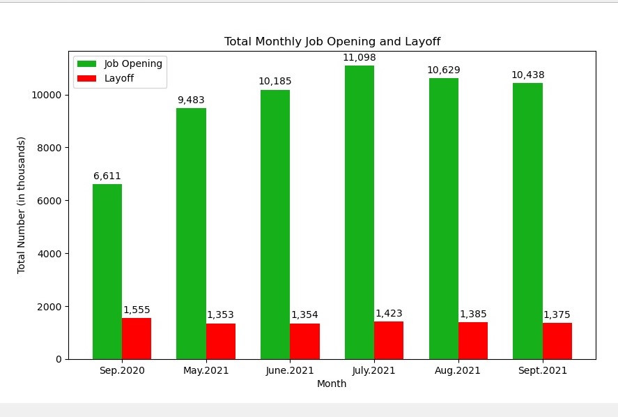
Total U.S. Job Openings and Layoffs by Month
Lessons Learned
Adding Tooltip to choropleth map to make it interactive
- Choropleth takes 2 types of data: the job data as well as the GeoJSONdata. The tooltip is based on the GeoJSON data, so the job data had to beintegrated with that in order to be reflected on the map.
- Many industries have experienced lasting changes after COVID-19
- Job openings increased throughout the pandemic while layoffs remained comparatively very low and stable
If I were to expand this project
- More insight would be provided from looking at mobility data from this time period
- Examining relocation data throughout the pandemic would provide more accurate conclusions on the nature of workforce evolution